.webp)
User Experience
A team launches a beautiful product. It wins praise from other designers and a place on a few inspiration sites. Then the numbers arrive: people drop out early, the support inbox fills up, and nobody seems to be coming back.
The gap between "award-winning" and "pleasant to use" is wider than the industry likes to admit. Awards go to what looks striking in a screenshot. Users have to get something done with it, often in a hurry, often on a small screen.
Good design has seven parts
Peter Morville, an information architect, described the qualities of a good experience as a honeycomb of seven cells. Looks are only one of them.
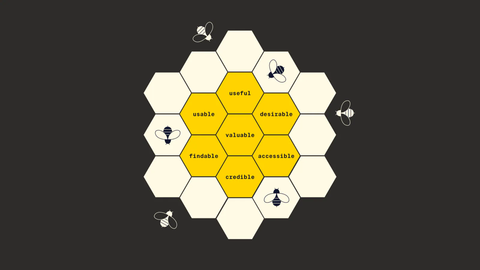
- Useful. It solves a problem people really have. A meditation app with lovely animations is no use if nobody ends up calmer.
- Usable. People can work it out without a manual.
- Desirable. It looks and feels good, and that draws people in.
- Findable. What someone needs is where they expect it. A cart button hidden for the sake of minimalism fails here.
- Accessible. People with different abilities can use it. This is a baseline, not a bonus.
- Credible. It behaves reliably and is honest about what it does, so people trust it.
- Valuable. It works for the business too. A product that cannot sustain itself will not be around to help anyone.
Google offers a shorter version of the same idea: usable, equitable, enjoyable and useful. The wording differs but the message is the same. Good experience comes from balance across several qualities, not excellence in one.
How a design goes wrong
- The screenshot trap. Gorgeous and desirable, but important features sit behind gestures nobody discovers.
- Easy and pointless. Smooth to use, with nothing worth using it for.
- Beautiful and exclusive. It looks wonderful and quietly shuts out anyone with low vision, limited movement or a different way of processing information.
Accessibility is where award-chasing most often fails. More than a billion people live with some form of disability, and almost everyone has a bad day: a broken wrist, glare on a phone, a noisy train. Designing for those cases improves things for everyone. Strong contrast helps a person with low vision and also someone reading outdoors. Clear navigation helps a person with a cognitive difference and also someone who is tired and distracted.
Designing for users instead of judges
- Start with research, not with a visual idea. Learn what people are trying to do before you open a design tool.
- Test early and often with real people. A jury of designers is not your audience.
- Measure what matters to users: tasks completed, errors made, time taken and how satisfied people felt.
- Design for the full range of people, abilities, devices and connections.
- Check every decision against the seven qualities above and notice which one is being sacrificed.
None of this means giving up beauty. It means treating beauty as one quality among several. The best products of the next few years will not only look good; they will work for the many different people who use them.
Your users do not care about the trophy. They care whether they can do what they came to do, quickly and without frustration. The best compliment a design can get is that nobody noticed it, because it simply worked.