.webp)
Web design
People decide quickly whether a site feels right for them, and most of that decision is emotional. A site with a clear personality gives a visitor a reason to stay. One without leaves them with a vague sense that something is off.
The website personality framework gives designers a structured way to make those choices. It groups design decisions into seven personalities, each suited to particular kinds of business. It is a starting point for deciding, not a rulebook.
1. Serious and elegant
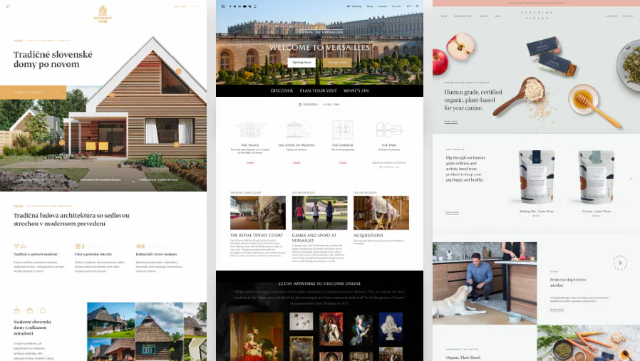
For brands that want to feel refined and exclusive. Typography is a thin serif with light weights and small body text. Colour leans on gold, pastels, black, dark blue and grey. Images are large and high quality, and layouts can be experimental. It avoids heavy shadows and rounded corners, and lets clean lines and premium photography carry the value. Good for real estate, high fashion, jewellery and luxury services.
2. Minimalist and simple
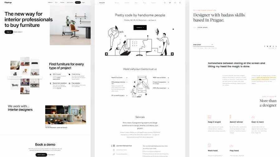
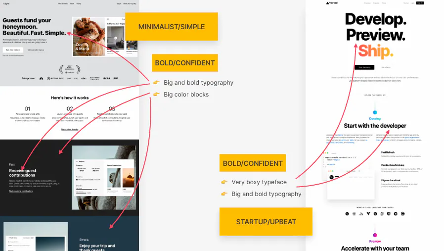
Everything that is not essential is removed. Type is a squared sans-serif at small sizes, colour is black or dark grey on white, and images are sparse and often black and white. Layouts are simple, often a single column. White space and typography do the work. Good for fashion, design portfolios and software start-ups.
3. Plain and neutral
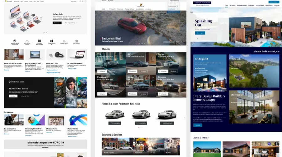
Function comes before impact so nothing distracts from the content. Type is a neutral sans-serif, colours are safe blues and blacks, images are small and used sparingly, and layouts are tidy and dense, built from organised boxes and rows. This suits established companies where trust and professionalism matter more than standing out.
4. Bold and confident
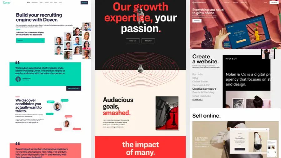
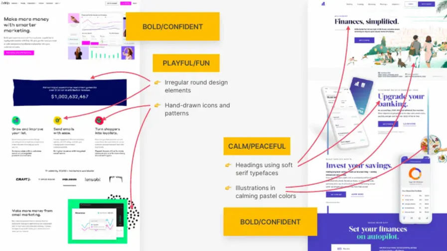
Made to hit hard. Large, heavy sans-serif type, often in capitals, multiple bright colours in big blocks, many large images and loose, varied layouts. It works for digital agencies, start-ups, travel companies and any brand with a strong position that wants to project confidence in a crowded market.
5. Calm and peaceful
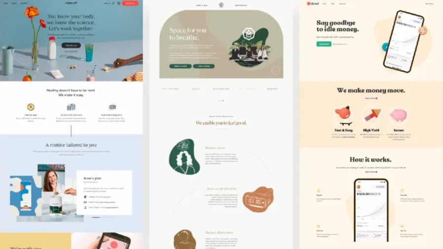
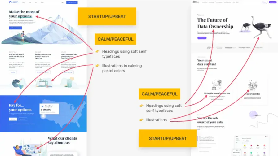
Designed to make people feel safe and looked after. Soft serif headings, though a sans-serif works, pastel and washed-out colours (light orange, yellow, brown, green and blue), illustrations and photos that match the palette, and gentle rounded corners with the occasional soft shadow. Right for healthcare, wellness and anything centred on a person’s wellbeing.
6. Start-up and upbeat
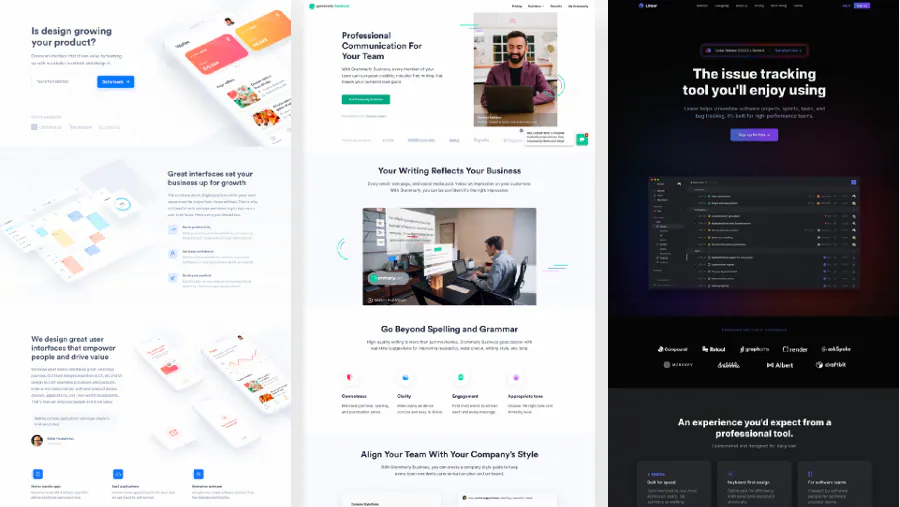
The look many tech companies have adopted to seem modern and friendly. Medium-sized sans-serif headings with lighter text, blues, greens and purples over light grey with gradients, 3D illustrations, patterns and shapes, and soft shadows, glows and rounded corners. Small animations help it connect with younger audiences.
7. Playful and fun
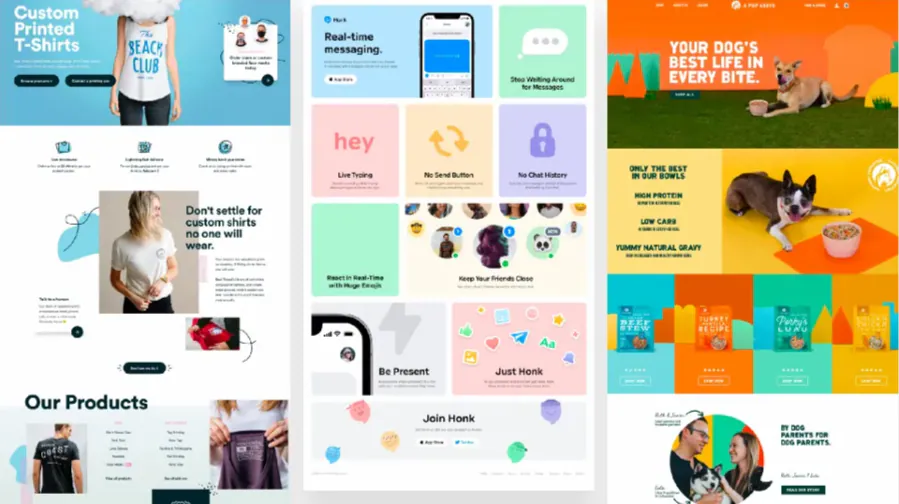
Creativity and colour make it memorable. Round, sometimes handwritten type with centred text, many vibrant colours across backgrounds and text, hand-drawn illustrations, 3D elements, geometric shapes and patterns, and rounded corners with light shadows. Suited to children’s products, pet businesses, food companies and entertainment.
Mixing them
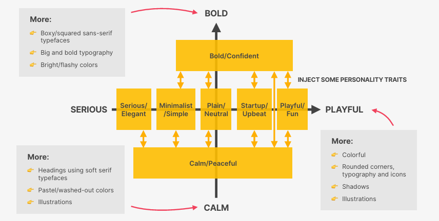
Few real sites sit entirely in one personality. A healthcare start-up could pair calm colours with an upbeat layout. A luxury technology brand might combine elegant type with bold colour. Pick a main personality, borrow deliberately from a second, and make sure the blend still feels like one voice.
Choosing for a project
Start with the client’s industry, audience and brand values, then ask four questions.
- What should a visitor feel when they arrive?
- What do people in this industry expect, and where is it safe to break from that?
- How should the brand stand apart from its competitors?
- Which personality traits does the audience value?
The answers point to a personality or a blend, and from there decisions about type, colour, imagery and layout become much easier to defend. Whether the brief is a luxury label, a start-up or a clinic, the goal is the same: a site that feels like the business behind it.