.webp)
Accessibility
The web is meant to work for everyone, yet most sites still fail. A large annual review of one million home pages found WCAG 2 failures on about 95% of them. Around 1.3 billion people worldwide live with a disability, and developers are the ones who decide whether they can use what we build.
Accessibility is not box-ticking. It means that people with disabilities can perceive, understand, navigate and interact with a site, and contribute to it. Done properly it also improves the experience for everyone, widens your audience and lowers legal risk.
Why it matters
- About one in four adults in the United States has some kind of disability.
- Two in five adults aged 65 and over do.
- Many people have hearing or vision loss that makes inaccessible sites hard or impossible to use.
- Surveys suggest most disabled customers will leave a site they cannot use, and take their money elsewhere.
There is a legal side too. In the United States the Americans with Disabilities Act is applied to websites, and thousands of digital accessibility lawsuits are filed each year, concentrated in retail, finance, hospitality and healthcare. Be wary of overlays and "one-line widgets" that promise compliance: they do not stop lawsuits and rarely fix the underlying problems. Real accessibility is built in from the start.
The standards in brief
The Web Content Accessibility Guidelines (WCAG), from the W3C’s Web Accessibility Initiative, are the common reference. They have three conformance levels.
- Level A: the minimum, and not enough on its own.
- Level AA: the recommended target for most sites and the level most often cited in law.
- Level AAA: the highest, usually impractical to meet across a whole site.
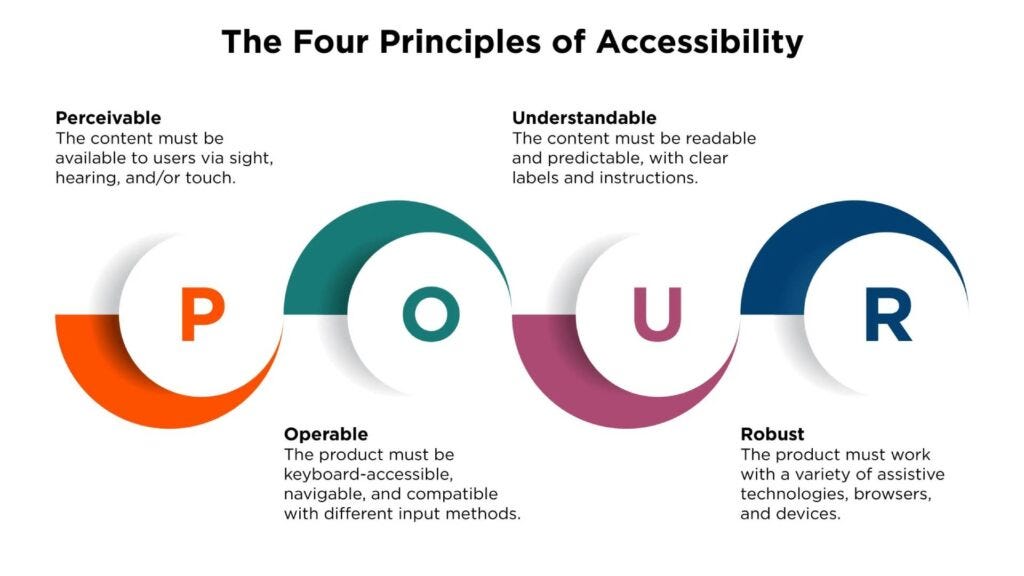
WCAG is organised around four principles, summed up as POUR. Content must be perceivable (people can take it in), operable (they can use the controls), understandable (it behaves predictably and makes sense) and robust (it works with different browsers and assistive technology).
WCAG says what must be achieved, such as sufficient colour contrast. WAI-ARIA is a toolkit of attributes for meeting those aims in complex, dynamic interfaces. WebAIM is a good independent source of plain-language advice and tools.
Keyboard users
Plenty of people navigate without a mouse, because of a motor or visual disability or simple preference. If your site cannot be used with a keyboard, it cannot be used by them.
Make the focus visible. Aim for at least a 3:1 contrast against its surroundings, a thickness of at least 2px, visibility in both light and dark themes, and ideally more than one cue.
.button:focus {
  outline: 2px solid #0066cc;
  outline-offset: 2px;
  background-color: #f0f8ff;
}

@media (prefers-contrast: high) {
  .button:focus {
    outline-width: 3px;
  }
}
Links with an href, buttons and form controls are already reachable with Tab and Shift + Tab. Use real elements wherever you can. If you must build a custom control, give it tabindex="0" and the right role. Use tabindex="-1" to take something out of the tab order. Avoid positive values, which scramble the natural order.
<!-- Prefer a real button -->
<button type="button">Save</button>

<!-- If you cannot, give a custom control focus and a role -->
<div tabindex="0" role="button">Save</div>
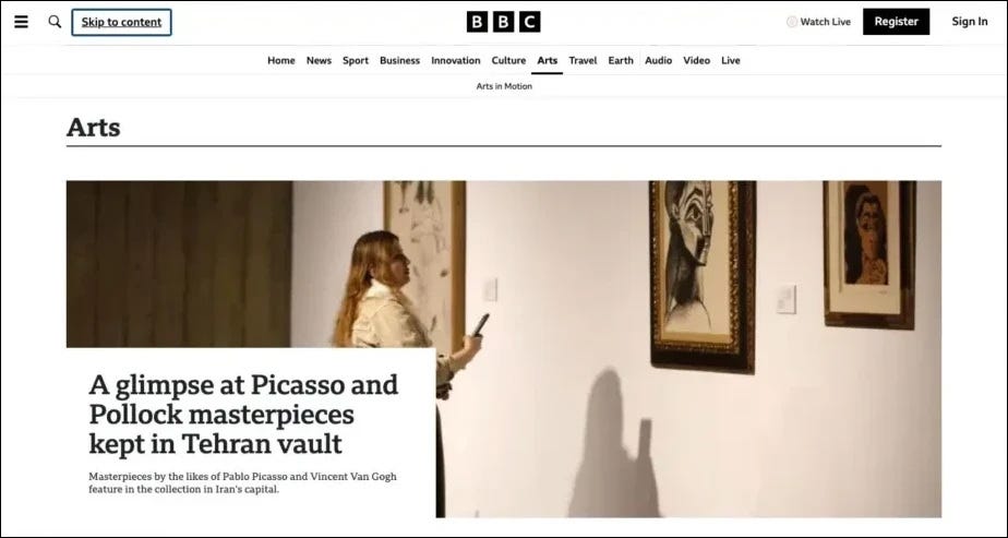
Add a skip link at the top of the page so keyboard users can jump past repeated navigation straight to the main content.
Screen readers
Screen readers turn a page into speech. They rely on the structure and text you provide, so the first job is writing meaningful alternative text. Describe the purpose of an image, skip phrases such as "image of", leave the attribute empty for pure decoration, and never stuff it with keywords. For complex images, add a longer description nearby.
<img src="chart-q3.png" alt="Q3 sales rose 23% on Q2, to $2.4 million">
<img src="divider.png" alt="">
Semantic HTML does most of the remaining work. Real headings, landmarks such as header, main and footer, lists and buttons give assistive technology a map of the page. A tree of anonymous divs gives it nothing.
ARIA fills the gaps native elements cannot. Use aria-label to name a control that has no visible text, aria-describedby to attach help text to a field, and aria-live regions to announce updates. The first rule of ARIA is to use a native element when one exists.
<button aria-label="Close dialog">×</button>

<input id="password" type="password" aria-describedby="hint">
<p id="hint">At least 8 characters, with a number and a symbol.</p>

<div aria-live="polite" id="status"></div>
Audio and video need alternatives too: captions and, where it helps, audio description for video, and a transcript for audio.
Colour and contrast
For WCAG AA, normal text needs a contrast ratio of at least 4.5:1 against its background and large text needs 3:1. Dark grey on white is comfortable; pale grey on white fails. Use a contrast checker such as WebAIM’s instead of trusting your eyes.
Never use colour alone to carry meaning. An error shown only as red text is invisible to many people. Pair it with an icon, a text message, a border and the right ARIA state.
<input type="email" aria-invalid="true" aria-describedby="email-error">
<p id="email-error">
  <span aria-hidden="true">⚠</span>
  Please enter a valid email address.
</p>
Mobile and zoom
Most adults with disabilities use a smartphone, so mobile support is part of the job. Make touch targets at least 44px square with some space between them, use a 16px base font on inputs so iOS does not zoom in, and check that the page stays usable at 200% zoom without sideways scrolling.
.button {
  min-height: 44px;
  min-width: 44px;
}

.grid {
  display: grid;
  grid-template-columns: repeat(auto-fit, minmax(250px, 1fr));
  gap: 1rem;
}

.content {
  overflow-wrap: break-word;
}
Testing
- Keyboard: tab through the whole site and complete a task without a mouse.
- Screen reader: try NVDA on Windows or VoiceOver on macOS.
- Contrast: check every colour pair with a checker.
- Zoom: view the page at 200%.
- Devices: test on real phones with assistive technology switched on.
The business case
- Reach: you can serve a large group that is often overlooked.
- SEO: semantic HTML, alt text and clear heading structure also help search engines understand a page.
- Better use for everyone: captions help in noisy places, good contrast helps in sunlight, and clear navigation helps everybody.
- Lower cost: building accessibly from the start is far cheaper than repairing a finished site, and it reduces legal risk.
Accessibility is not a finish line. Every time you choose a real button over a div, write honest alt text or check a contrast ratio, the web becomes a little more open. Start small, test often, and keep improving.